UI Design for Hunter Valley, HWTA.
Designed by me while working at the Creative Agency: Edge (Sydney, Manly).
Creative:
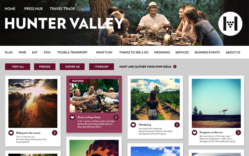
Integrated look and feel with shared asset management across all platforms.
The following designs demonstrate my ability to: Execute a new digital strategy that will push the refreshed brand position and differentiate the Hunter as the wine destination of choice for young food loving couples. Through smart new digital distribution of content, reach and drive preference and intention for the region significantly lifting visitor numbers. It brings digital engagement through a renewed integrated digital and social strategy.
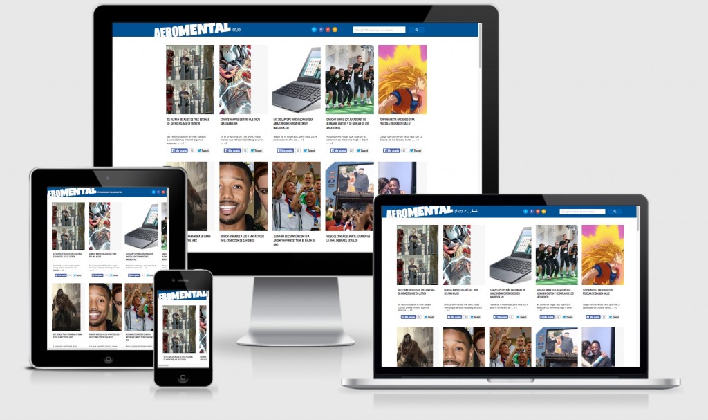
Responsive:
Site designed to work beautifully on any sized device. Scalable and with content prioritise according to user context and need state.

Detail:
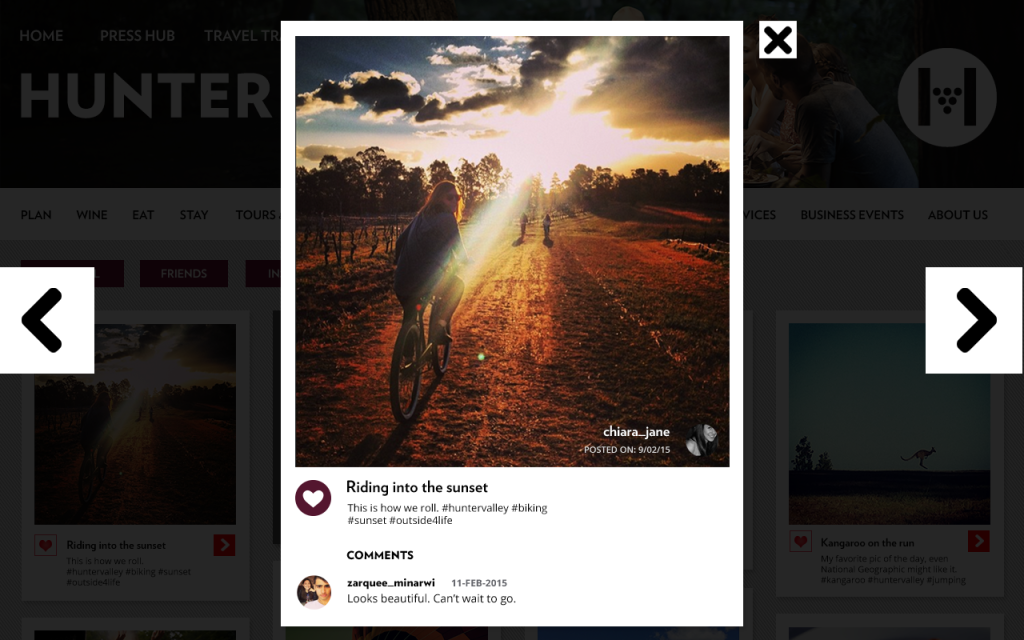
Open a social post and get details such as location, description etc. Comment, share and add to itinerary.

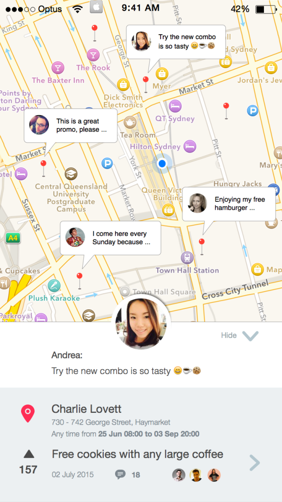
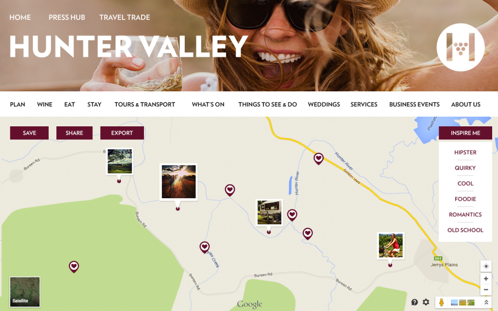
Map
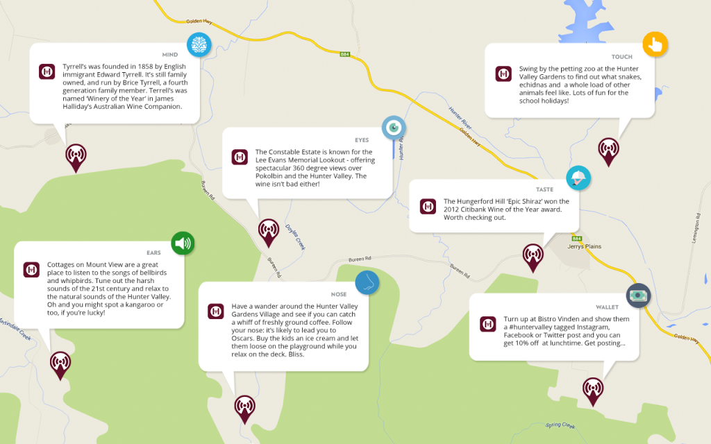
: View favourite items on map in a more visual format. Each pin can be expanded to show social photography and more.

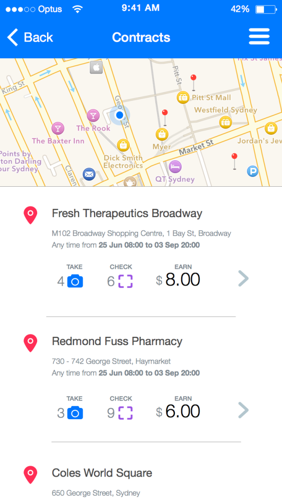
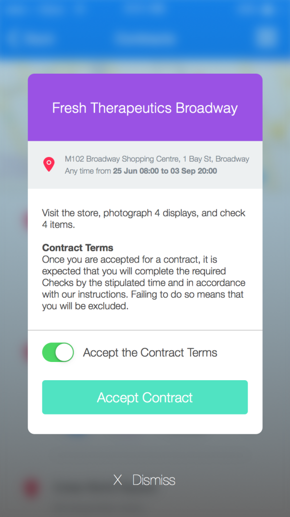
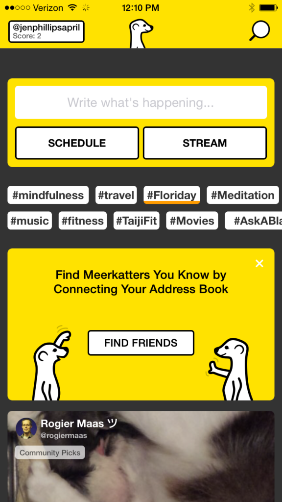
Usage of iBeacons for promotions and events discovery:
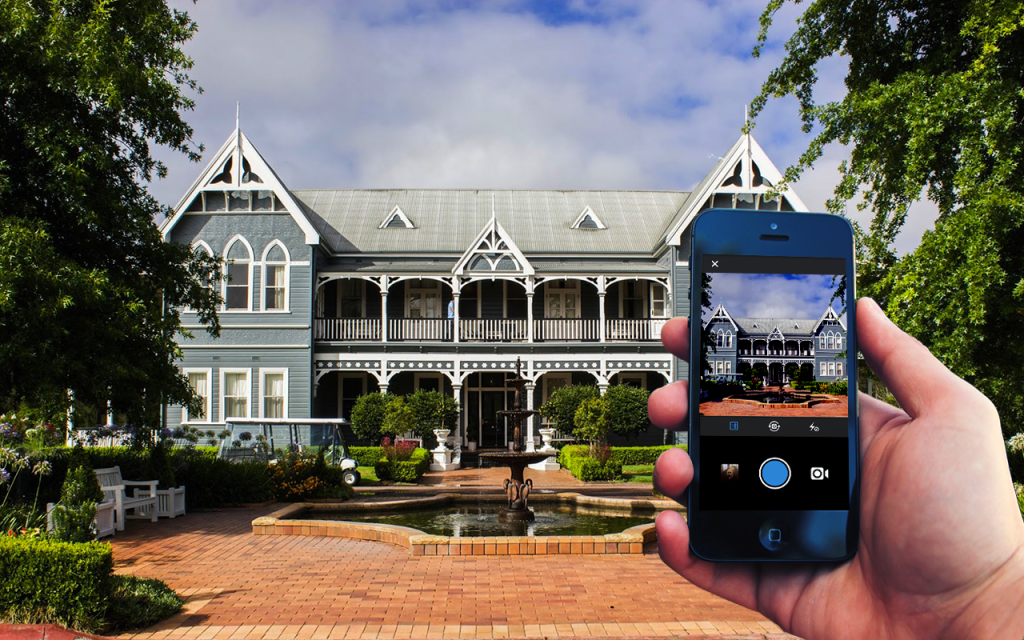
Integration with Instagram:
